CSS3 – Create a Simple Tooltip
Tooltip is a great way to show more informations by simply hovering over an image or text.
Created a simple CSS3 tooltip with help of HTML and CSS.
In this tutorial I am going to show you how to create a simple tooltip with the help of HTML and CSS.
Demo Code
index.html
<html>
<head>
<meta http-equiv="Content-Type" content="text/html; charset=utf-8">
<meta http-equiv="Lang" content="en">
<title>TechGuru | Simple Tooltip with CSS3</title>
<link rel="stylesheet" type="text/css" href="style.css">
</head>
<body>
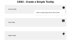
<h1 align="center">CSS3 - Create a Simple Tooltip</h1>
<div id="tg_content_main">Normal Tooltip
<div class="tg_tooltip_question">
<p>Create a simple tooltip with the help of CSS3</p>
</div>
</div>
<div id="tg_content_main">Help Tooltip
<div class="tg_tooltip_help">
<p>Create a simple tooltip with the help of CSS3 <a href="http://techgurulive.info/">TechGuruLive.info</a></p>
</div>
</div>
<div id="tg_content_main">Image Tooltip
<div class="tg_tooltip_image">
<p>Create a simple tooltip with the help of CSS3 <br /><a href="http://techgurulive.info/"><img src="http://www.techgurulive.info/wp-content/uploads/2014/07/logo.png" /></a></p>
</div>
</div>
</body>
</html>
style.css
body{
	font-family:Arial, Helvetica, sans-serif;
	font-size:14px;
}

.tg_tooltip_question{
	text-align: center;
    background-color: #000000;
    position: absolute;
    top: 18px;
    right: 18px;
    border-radius: 50%;
    width: 24px;
    height: 24px;
    font-size: 14px;
    line-height: 26px;
    cursor: default;
}

.tg_tooltip_image{
	text-align: center;
    background-color: #000000;
    position: absolute;
    top: 18px;
    right: 18px;
    border-radius: 50%;
    width: 24px;
    height: 24px;
    font-size: 14px;
    line-height: 26px;
    cursor: default;
}

.tg_tooltip_help{
	text-align: center;
    background-color: #000000;
    position: absolute;
    top: 18px;
    right: 18px;
    border-radius: 20%;
    width: 30px;
    height: 24px;
    font-size: 14px;
    line-height: 26px;
    cursor: default;
}

.tg_tooltip_question:before{
    content:'?';
    font-weight: bold;
    color:#fff;
}

.tg_tooltip_image:before{
    content:'img';
    font-weight: bold;
    color:#fff;
}

.tg_tooltip_help:before{
    content:'help';
    font-weight: bold;
    color:#fff;
}

.tg_tooltip_question:hover p, .tg_tooltip_image:hover p, .tg_tooltip_help:hover p{
    display:block;
    transform-origin: 100% 0%;
    -webkit-animation: fadeIn 0.3s ease-in-out;
    animation: fadeIn 0.3s ease-in-out;
}

.tg_tooltip_question p, .tg_tooltip_image p, .tg_tooltip_help p{
    display: none;
    text-align: left;
    background-color: #FFFFFF;
    padding: 20px;
    width: 300px;
    right: -4px;
    color: #000;
    font-size: 13px;
    line-height: 1.4;
	position: absolute;
    border-radius: 3px;
    box-shadow: 1px 1px 1px rgba(0, 0, 0, 0.2);
}

.tg_tooltip_question p:before, .tg_tooltip_image p:before, .tg_tooltip_help p:before{
    position: absolute;
    content: '';
    width:0;
    height: 0;
    right:10px;
    top:-12px;
	border:6px solid transparent;
    border-bottom-color: #FFFFFF;
}

.tg_tooltip_question p:after, .tg_tooltip_image p:after, .tg_tooltip_help p:after{
    width:100%;
    height:40px;
    content:'';
    position: absolute;
    top:-40px;
    left:0;
}

@-webkit-keyframes fadeIn{
    0% {
        opacity:0;
        transform: scale(0.6);
    }

    100% {
        opacity:100%;
        transform: scale(1);
    }
}

@keyframes fadeIn{
    0% {
		opacity:0;
	}
    100% {
		opacity:100%;
	}
}

#tg_content_main{
    background-color: #F0F0F0;
    border-radius: 4px;
    padding: 40px;
    margin: 0 auto;
    max-width: 600px;
    position: relative;
    margin: 0 auto 50px;
}
Leave a Reply